Design publications release annual lists of trending colors each January. Pantone announces their Color of the Year. Industry discussions focus on what appears current versus what seems outdated. What these conversations often miss is a fundamental truth: selecting website colors based on trends alone rarely serves a business well.
Effective color choices reflect brand identity, resonate with specific audiences, and meet accessibility standards not simply follow whatever appears fashionable this season. New Braunfels web design from Texas Web Design begins with understanding business objectives rather than copying popular aesthetics.
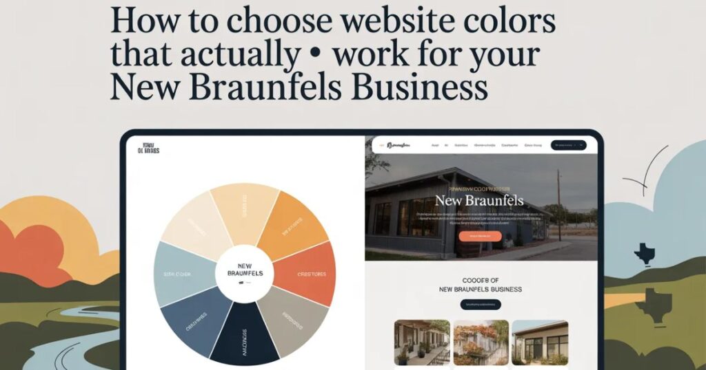
What Colors Communicate on Websites
Color choices carry meaning whether intentionally planned or not:
Blue conveys trust and professionalism. Financial institutions, healthcare providers, and insurance companies frequently select blue because it creates feelings of security and reliability.
Red generates urgency and captures attention. Sale prices appear in red deliberately the color increases physiological arousal and draws focus. However, excessive use can create anxiety rather than motivation.
Green suggests health, growth, and environmental responsibility. Organic brands, financial services emphasizing growth, and sustainability-focused companies rely heavily on green associations.
Orange and yellow project energy and approachability. Quick-service restaurants use these colors because they stimulate appetite and feel welcoming. Professional services firms typically avoid them for this reason.
Black and white communicate luxury and sophistication. Premium brands use minimal color palettes to convey exclusivity and refinement.
These associations shift based on context, cultural background, and audience characteristics. A color palette appropriate for childcare services would undermine credibility for legal services.
What Matters More Than Current Trends
Industry Standards Shape Expectations
Each sector carries established color associations. Medical websites typically use blues and whites because these colors feel clean and trustworthy. Creative agencies can employ bold, unconventional choices as demonstrations of their capabilities. Financial services maintain conservative palettes because monetary matters require serious presentation.
Defying these expectations without strategic purpose confuses potential clients rather than distinguishing the brand.
Existing Brand Identity Provides Direction
Established businesses already have color associations in logos, physical locations, and marketing materials. Website colors should reinforce rather than contradict what customers already recognize.
Changing core brand colors because design publications declare certain shades outdated resembles repainting a restaurant annually. The practice proves expensive, creates confusion, and eliminates recognition built over time.
Audience Characteristics Determine Appropriateness
A technology startup serving young professionals can employ different colors than a retirement planning service. Products for children permit bright, playful palettes. Enterprise software should maintain clean, professional presentation.
Understanding the target audience matters more than following general design trends. Effective design serves specific users, not design award committees.
What Deserves Careful Attention
Accessibility Requirements Are Mandatory
Web Content Accessibility Guidelines (WCAG) specify minimum contrast ratios between text and backgrounds. These standards represent legal requirements in many jurisdictions and determine whether content remains readable for all users.
Light gray text on white backgrounds may appear elegant in design mockups while remaining unreadable for anyone with less than perfect vision a category including most people over 40.
Competent designers verify contrast ratios automatically. Those prioritizing appearance over function create unusable websites regardless of aesthetic appeal.
Screen Variations Affect Color Perception
Colors appearing perfect on calibrated desktop monitors may look entirely different on mobile devices in bright sunlight. Effective color schemes work across devices, screen types, and viewing conditions.
This requires testing on actual phones and tablets, not simply resizing desktop browsers to smaller dimensions.
Limited Palettes Maintain Clarity
Select two to three primary colors plus neutrals (black, white, grays). Exceeding this range creates visual chaos that undermines professional presentation.
The primary color carries brand identity. Secondary colors provide contrast and variety. Accent colors highlight calls-to-action. Additional colors rarely improve effectiveness.
What to Ask Design Professionals
Regarding Color Strategy:
- What reasoning supports these specific color selections for this business?
- How do these choices align with industry standards and target audience expectations?
- What colors do primary competitors use, and how does this palette create differentiation?
- Will these colors maintain relevance over time, or will they appear dated within months?
Regarding Accessibility:
- Does this color scheme meet WCAG contrast requirements?
- Has testing included users with vision impairments?
- How does the design perform with high-contrast mode or colorblind settings enabled?
Regarding Practical Implementation:
- How will these colors display across different devices and screen types?
- Can matching colors be reproduced in print materials and physical signage?
- If brand colors lack sufficient contrast, what solutions address this limitation?
Geographic Considerations for New Braunfels Businesses
Location affects web design minimally regarding color selection. Business type, target audience, and brand identity matter significantly more than geographic placement. Whether operating in New Braunfels, San Antonio, or elsewhere does not fundamentally change color psychology principles.
Local factors that do influence color decisions include:
- Industry mix (tourism, healthcare, retail, service businesses have different requirements)
- Competitor color choices within the specific market
- Regional cultural elements (German heritage, Texas identity) that may inform brand development
- Customer demographics particular to the area
These considerations relate to strategic positioning rather than trend-following.
The Fundamental Principle
Color trends evolve constantly. Strong brands maintain consistency.
Select colors that serve business objectives, audience needs, and long-term goals. Verify accessibility compliance. Test across real devices and conditions. Then maintain those colors long enough for customers to develop associations between the palette and the brand.
The most effective website colors are not the trendiest selections. They are the colors that help specific customers accomplish their goals whether purchasing products, learning about services, or initiating contact.
Trends shift with seasons. Sound strategy endures.